Website: Special Olympics
Overview
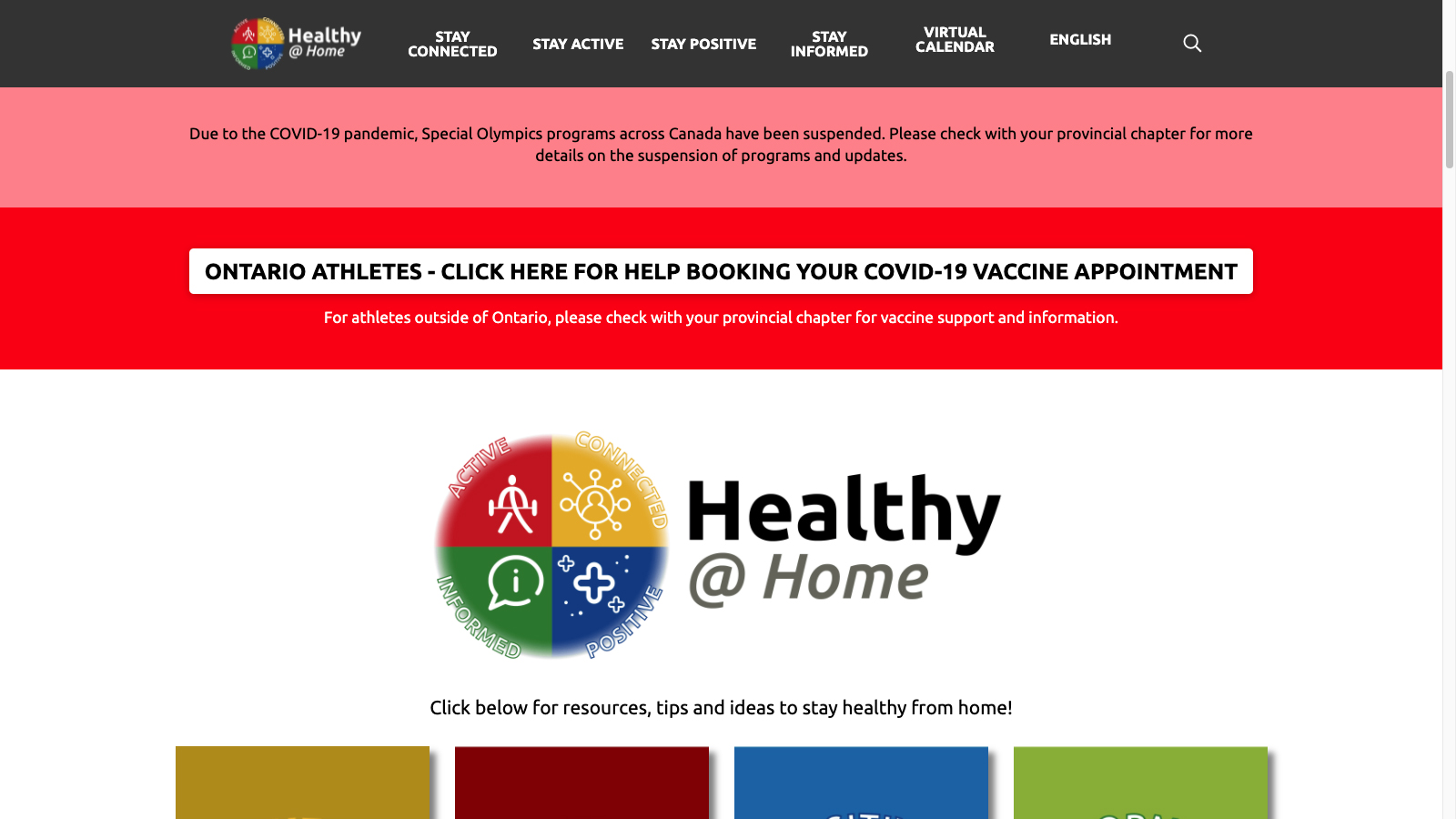
Five colleagues and I recommended improvements to Healthy at Home, a Special Olympics website. This project was done for a course in collaborative user-experience design. We partnered with Special Olympics Ontario to understand the site’s users. Then we used the design-thinking process to make information easier to find, which was the main issue. We made recommendations for global navigation, page layouts, and content authoring.
Roles:
- Information architect
- Moderator
- Project manager
- Technical consultant
Skills:
- Critical thinking
- Group-activity facilitation
- Leadership
- Wireframing (Balsamiq)
- WordPress
Process
Understand: Empathize
Meet with product owners: Learn about users and social-technical systems
We met three Special Olympics Ontario employees who led the site’s creation and upkeep. They gave insight about their organization and stakeholders. They also gave access to user-research findings about their services. For the Healthy at Home site, one important theme was that its content was hard to find.
Identify and articulate users’ needs
Thanks to our partners, we started with solid understanding of the users. The primary group were Special Olympics athletes. Their abilities and situations varied, but we had to consider their special needs:
- Technical accessibility: Older devices and slower connections
- Readability: Reading-levels at Grade 3-4
- Non-verbal clarity: Reliance on colors and imagery to discern content
- Prominent content: Limited capacity/tolerance for browsing and searching
Visualize relevant components of systems
We mapped the relevant people, processes, and products onto template canvases. We made educated guesses and did cursory research as needed. Later, we met with our partners and got feedback for our visual summaries of their business model and value proposition. The activity was useful because it reinforced our understanding of the larger context.
- View the business-model canvas (PDF, 52 KB)
- View the value-proposition canvas (PDF, 533 KB)
Do heuristic evaluation: Highlight problems and probable causes
We independently browsed the site and made notes about our experiences. We had consensus about the following persistent issues:
- Slow loading: Content was slow to load
- Limited categories: Some content didn’t fit one, or any, main category
- Limited wayfinding: Lack of breadcrumbs, current-location indicator
- Vague descriptors: Titles and summaries didn’t communicate useful info
- Complex descriptors: Some terms had simpler alternatives
- Undiscernible thumbnails: Images were faint or generic/repeated
- Irregular layout: Content blocks had varying dimensions
Prepare for primary research: Set goals, select methods, and develop tools
Our goal was to test the usability of the site’s navigation and organization. We needed both qualitative data (‘how?’ & ‘why?’) and quantitative data (‘how many?’). We created a usability test that consisted of information-finding tasks. We also created semi-structured interview questions for users to describe their experiences.
- Download the moderator’s script 1 (DOCX, 36 KB)
- View the moderator’s script 1 (PDF, 98 KB)
Do user-evaluation
Our partners connected me with athletes, coaches, caregivers, and volunteers. I set up appointments for four sessions that involved seven users. I moderated three of the sessions while my colleagues recorded observations.
Understand: Define
Analyze and summarize findings of primary research
My colleagues and I met to review our observations of the user-evaluation sessions. In general, the users echoed our heuristic evaluations. We paid attention to how they browsed and searched for content.
Establish awareness and agreement of problems to solve
Some pain-points and pain-relievers were beyond our control. We focused on themes that were feasible to address:
- Navigation and organization
- Clarity and utility of descriptors
- Clarity and utility of thumbnail images
Articulate users’ needs for others to understand
My colleagues and I envisioned a persona, or hypothetical and archetypical user. We named her Ashley the Athlete. First, we produced an empathy map. This artifact expressed the plausible activities, feelings, and thoughts with the site experience. Then, my colleague developed a summary of this persona.
- View the Ashley empathy map (PDF, 850 KB)
- View the Ashley persona (PDF, 804 KB)
Articulate typical user’s journey within larger systems
Ashley served as the protagonist of our storytelling presentation. One other colleague made an experience map that summarized her journey, including pain points. The map also showed parts of the larger system that affected her journey. (We received feedback that the map depicted an unrealistic number of different emotions.)
- View the ‘As Is’ experience map (PDF, 2 MB)
Articulate users’ desired outcomes: Create high-level statements to guide (not offer) solutions
We made statements that implied user-needs being met. These statements focused on the destination, not the journey.
- Ashley can read and understand all text in the global navigation menu, without any help from her caregivers.
- Ashley can get to the website content that she is looking for, with no more than three clicks.
- Ashley can understand any piece of content on the website, without selecting the content itself.
- Ashley can find any particular content using multiple pathways, according to her preference.
Explore: Ideate
Review (causes of) problems and ideate solutions
We established solutions that would eliminate, or at least mitigate, the problems that we had identified:
- Slow loading: (Not focus of project)
- Limited categories: More categories and clearer labels
- Limited wayfinding: Breadcrumbs, current-location indicator in global navigation
- Vague descriptors: Tips for content authors
- Complex descriptors: Tools for content authors
- Undiscernible thumbnails: Tips for content authors
- Irregular layout: Uniform dimensions for content blocks
Refine solutions into simple directives addressing users’ desired outcomes
The next logical step was summarizing the main actions that we would take. Each directive addressed one or more of the users’ desired outcomes that we had already established.
- Revise global navigation: Create logical categories and clear labels
- Develop guidelines for authors: Ensure descriptors and images are useful
- Research tools for authors: Find checkers that evaluate simplicity of text
- Research WordPress themes: Experiment with frameworks to make pages less complex
Diverge to create solutions and converge to gain consensus
To revise the global navigation, we independently proposed more categories. (The user evaluations showed that some users favored the four main ones.) Then, we collectively mapped all content to sticky-notes and arranged them on a whiteboard. Next, we re-organized the content based on our findings and understanding of users. The process was arduous because of its inherent uncertainty, but it was important.
- View sitemap ver 1 (PDF, 23 KB)
- View sitemap ver 2 (PDF, 21 KB)
- View sitemap ver 3 (PDF, 170 KB)
- View sitemap ver 4 (PDF, 170 KB)
For other navigational features, I suggested tags and a sidebar for non-home pages. Our partners had built the site with WordPress, and I had experience with this CMS. I knew that implementing tags and sidebars would be workable and desirable. A few of us sketched page-layouts that included these features.
Explore: Prototype
Develop prototypes to make ideas real and showable
Our partners set up a clone of the live site for us to use. We re-organized the global navigation to reflect the information architecture that we modified. One colleague created medium-fidelity prototypes for pages that fit the existing design. The home page featured a carousel and uniformly-arranged blocks of content. The non-home pages featured tags and a sidebar with menus. Thus, we had two prototypes to test with users:
- Cloned WordPress site with revised global navigation (limited interactivity)
- Medium-fidelity Figma mockups of revised page layouts (no interactivity)
- View the page layouts (PDF, 6.1 MB)
Materialize: Test
Develop research (evaluation) goals and appropriate tools
Our goal was to test the intuitiveness of our global navigation and page layouts. We created a usability test that was similar to the first one. The information-finding tasks only involved the global navigation. So, these tasks could be described as a tree-testing activity. We also created a semi-structured interview to ask about the mockups of the revised page-layouts.
Test prototypes with users to (in)validate solutions
I re-connected with users from the previous round of user evaluations. Our partners also connected me with other users. I set up appointments for four remote sessions with seven users. Two users were people whom we hadn’t already met. I moderated one session and observed the other ones.
- Download the moderator’s script 2 (DOCX, 26 KB)
- View the moderator’s script 2 (PDF, 94 KB)
Materialize: Iterate
Analyze test findings and modify prototypes as needed
We summarized the findings and feedback from the second set of user evaluations. Some of the new categories and labels weren’t as logical or clear as we had believed. The order of the categories needed modification, too. Again, we used our findings and understanding to revise the global navigation. One colleague modified the page-layout mockups based on users’ suggestions.
Finalize
Articulate solutions for others to understand
We created a presentation that featured Ashley the Athlete. With her as the protagonist in a story, we compared the as-is (before) and the to-be (after) experiences. One colleague produced a project report that we all reviewed. Another colleague produced an experience map that summarized the to-be scenario.
Add value for product owners
Still another colleague produced guidelines for content authors. These guidelines suggested ways to write descriptors, select images, and organize content. I produced a set of wireframes that served as instructions for developing the revised page-layouts. Later, we met our partners to debrief them and provide the deliverables.
Deliverables
- Download the Healthy at Home design report (DOCX, 29 KB)
- View the Healthy at Home design report (PDF, 84 KB)
- View the ‘To Be’ Healthy at Home experience map (PDF, 5 MB)
- Download the information architecture (DOCX, 20 KB)
- View the information architecture (PDF, 46 KB)
- View the final sitemap (PDF, 29 KB)
- View the page wireframes (PDF, 1MB)
- View the page prototypes (Figma)
- Download the authoring recommendations (DOCX, 19 KB)
- View the authoring recommendations (PDF, 77 KB)
Takeaways
Presentations need to be story-based and visual
Our first presentation started with the Ashley persona, but the focus shifted to the site’s issues. At the very least, we could’ve put Ashley’s picture on every presentation slide. We could’ve noted how each issue hindered her experience on the slides as well.
Websites need to be both browsable and searchable
Browsing and searching are related, but they’re distinct activities. Users do the former when they have less understanding of the information that they want. Content needs to have descriptors and signifiers to help users make decisions.
Test with real users whenever possible
We were lucky to have partners who had willing contacts. Otherwise, we wouldn’t have been able do testing with this population. User evaluations revealed notable flaws of our revised global navigation.