Netflix availability info
- 9 Jun 2020
- Netflix doesn't warn users about shows that have expiring availability. This information is available, but it's not presented in a prominent way. The mobile version is a bit more clear than the desktop version.
Context
Mad Men is one of my all-time favorite shows. I watch it every few years. Even though I own the series in other formats, I prefer watching it through Netflix. But a few weeks ago, I learned that it would be leaving the service. Mad Men will be gone as of 12 midnight PST on 10 June 2020. If I were a first-time viewer, I’d be frustrated that I couldn’t finish watching the series. I’d also be confused if the show is gone all of a sudden and without any trace.
Flaws
Desktop Version
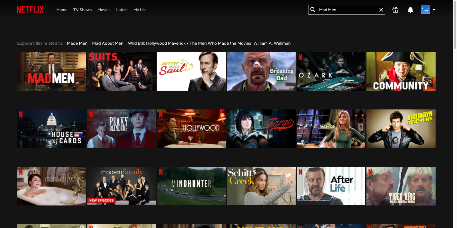
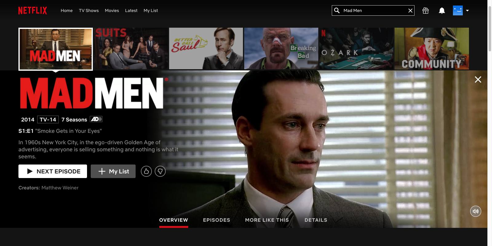
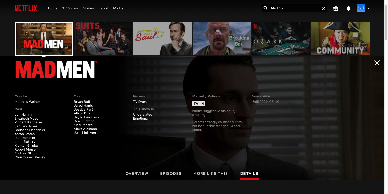
The desktop version doesn’t prominently communicate the expiring availability of shows. Their thumbnails and overviews aren’t distinct from other shows. The user has to select the Details panel for a given show and then select the Availability section. However, the Availability section only appears if the show’s availability is expiring. This inconsistency can result in users not even considering to view the Details panel.
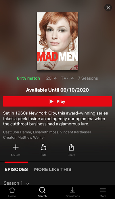
Mobile Version
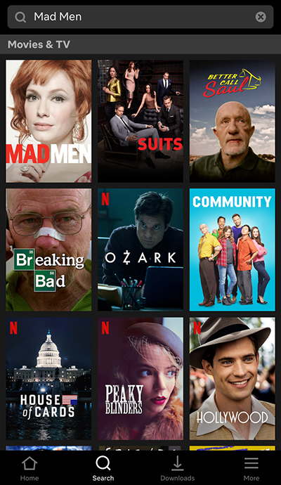
The mobile version has a similar issue, but overviews of shows have noticeable text. That is, their availability deadline is prominent. Nonetheless, users might not see this text. Other page elements are competing for their attention.
Fixes
I would style thumbnails of departing shows to make them distinct. A horizontal or angled banner would be prominent without being tacky. For overview panels, I would display a message over the auto-played clip. The intent is to get users’ attention. The scheduling of these notices would depend on the length of the departing show. Users should have enough notice to watch an entire show before it’s gone.
Netflix could promote departing shows with a “Watch Before It’s Gone” collection. The service could list it with other curated/generated collections. I understand why Netflix wouldn’t want to highlight something that’s negative. However, it could create a sense of scarcity and urgency. With these proposed changes, Mad Men could’ve gained some new fans.