MLS has a new logo
- 23 Sep 2014
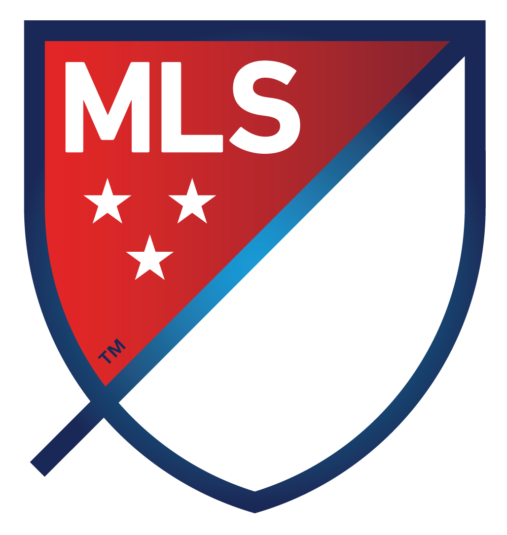
- Major League Soccer has recently unveiled its new logo, which is part of a larger rebranding effort. I don't care about the on-field product, but I do like the visual identity.

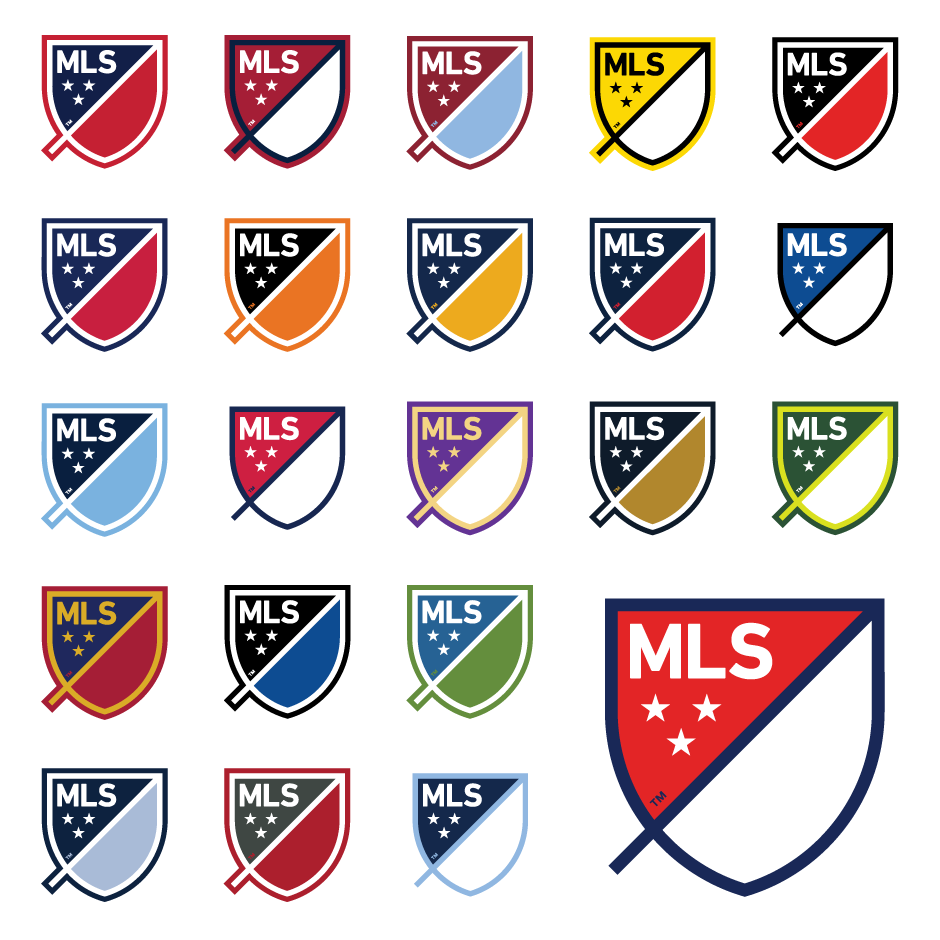
The slash and the two asymmetrical parts are definitely unique. I’m starting to like how the slash extends past the perimeter of the crest. I like the sans-serif typeface and the triangle formation of the stars. You can’t do anything wrong with a red-white-and-blue palette, either. The gradients look nice, but the slash and the “MLS” part of the crest seem to have different gradient angles.
Every part of the new logo is supposed to represent something about soccer (MLS), even though it doesn’t show a soccer player like the current logo. Instead of being a white silhouette and a blue background like the MLB, NBA, and PGA Tour logos, the crest is more like the NFL and NHL shield logos. The new logo is basically a contemporary version of crests and shields that are common in soccer and other sports.
The best thing about this design is its creative versatility. Its colors can be changed to appear on any uniform or merchandise without clashing, and it’s still easy to recognize.

MLS Next is the name of the league’s effort to rebrand itself, and the new logo is obviously an important part of this effort. I like the modern look, but I want further rebranding: one thing that I dislike about the league is the pretentious names of some teams. “Sporting” Kansas City. DC “United”. “Real” Salt Lake. Seattle Sounders “FC.” These MLS teams have all named themselves after famous European clubs as a way to borrow some prestige.
The main reason that I don’t watch MLS games is the league’s inferiority compared to the European power leagues. I want to see legit, world-class players do their thing, not relative scrubs and foreign stars who are several years past their prime. The MLS can’t shed their label as a retirement league overnight, but they can rebrand, or at least rename, their teams in interesting ways like they’ve done with their logo.