Accessibility: Nintendo Switch
Overview
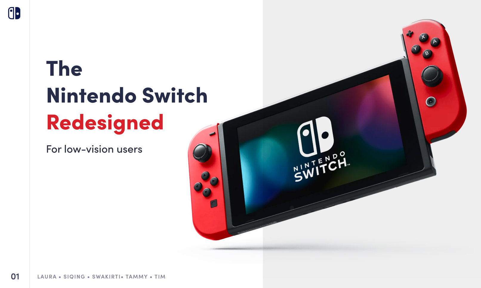
Four colleagues and I proposed to make the Nintendo Switch more accessible to low-vision players. We did this project for a course about accessible and inclusive design. It involved secondary and primary research, expert interviews, and user testing. The final output are mockups for font-scaling, screen filters, and colored button-covers. We created a presentation to summarize the output.
Roles:
- Co-researcher (secondary, primary)
- Co-presenter
- Co-writer
Skills:
- Critical thinking
- Community engagement
- Self-Evaluation
- Synthesis
- Video/audio editing (Final Cut Pro X)
Process
Understand: Empathize
Select problems to solve
A few of us had personal interest and experience with video games. This medium is highly visual. Yet, the Switch hardware and software can create barriers for visually-impaired people
Use a framework: ask high-level questions about prior context and predicted outcomes
We did a cycle-of-exclusion exercise. This practice involved interrogating the Switch’s creation, its intended users, and actual users:
- Who made it?
- Why was made it?
- How was it made?
- Who was it made for?
- Who uses it?
We also interrogated our ideas to better define our approach to the problem:
- What to redesign?
- Why redesign it?
- Who will benefit?
- How will we do it?
- Where will it fit?
- When will we do it?
Our prior experiences and tacit knowledge were the basis for our answers. We did some factual research as well.
Understand: Define
Present ideas to peers and experts
We submitted our framework notes to the instructor and presented them to classmates. The consensus was favorable, but peers noted that we could narrow our focus. The instructor provided guidance and advice: “It’s not about design, it’s about meeting needs.”
- Download the design framework (DOCX, 37 KB)
- View the design framework (PDF, 142 KB)
Do secondary research about relevant and related topics.
We searched for popular content that discussed vision impairments and video games. We also searched for information about accessible media and vision health. The following sources were helpful:
- Advocates: Game Accessibility Guidelines, Game Maker’s Toolkit
- Sources of authority: BBC, W3C, WHO
- User stories: gaming outlets, social media (Reddit, Twitter)
Do primary research as users and as evaluators
A few of us experimented with games and systems that we owned. We noted features, or lack thereof, that impacted visually-impaired users. I sought user stories on a GameFAQs message board. I asked, “What are your experiences with gaming and the Nintendo Switch in particular?”
Explore: Ideate
Articulate barriers as well as solutions with justifications
We had each examined one barrier that visually-impaired players encounter. We also proposed solutions and justified them with evidence (examples or research). Together, we wrote a proposal of design solutions:
- Small text: Font- and UI-scaling
- Uniformly-styled buttons: Colors for directional and face buttons
- Limited alternatives to text: Guidelines for narration and audio cues
- Limited color-modifying options: Options for display palettes
- Limited alternatives to audio/visuals: Guidelines for captions and subtitles, other cues
- Download the design proposal (DOCX, 9 MB)
- View the design proposal (PDF, 5 MB)
- (I edited the proposal and wrote section 3.3)
Get expert feedback and adjust plans as needed
The instructor connected us with an inclusive designer who was a senior employee of a major video-game company. This expert explained software architecture and development cycles for video games. Based on their feedback of our solutions, we narrowed the scope of our project:
- Low-vision users (instead of all visually-impaired users)
- Three barrier-solutions (instead of five)
- Font- and UI-scaling
- Colored buttons
- Options for screen filters
Explore: Prototype
Develop prototypes to make ideas real and showable
Three of my colleagues each developed prototypes, using Figma, for one solution. For visual guidance, they used the official system-interface and controller designs. My other colleague and I prepared for the final report. I also continued my discussion with users via GameFAQs.
Materialize: Test
Show-and-tell prototypes with experts and users
Through recruiting and referral, we had separate chats with four people. One person was an expert in assistive technology and a special-needs educator. The other three people were gamers who had different visual impairments. We had some notable insight, opinions, and suggestions:
- People with certain cognitive impairments need uniformly-colored buttons
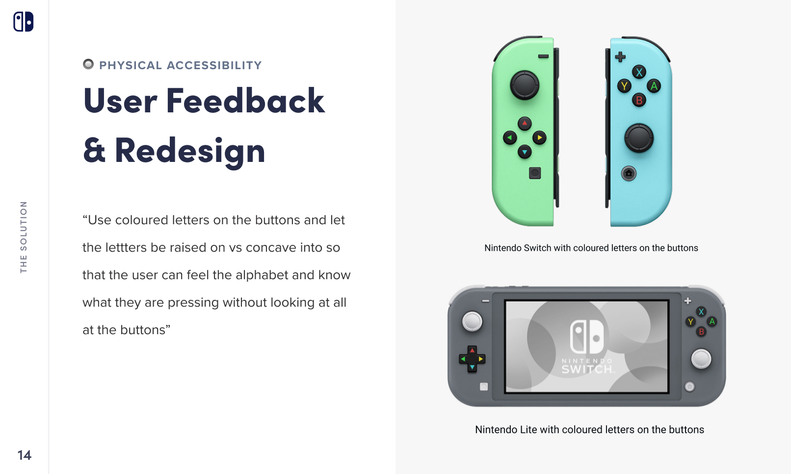
- Users preferred colored glyphs instead of colored buttons
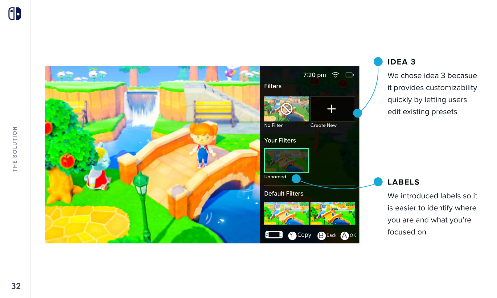
- Users preferred a combination of pre-set filters and custom ones
- Button glyphs could be convex (raised) for tactile guidance
Materialize: Iterate
Modify prototypes based on findings
My colleagues modified the prototypes that they had developed. One colleague and I had the same idea: custom button-covers would be more desirable, feasible, and viable than custom controllers. Button-covers could be offered in both same-colored and different-colored sets. The following iterations were the final solutions that we presented:
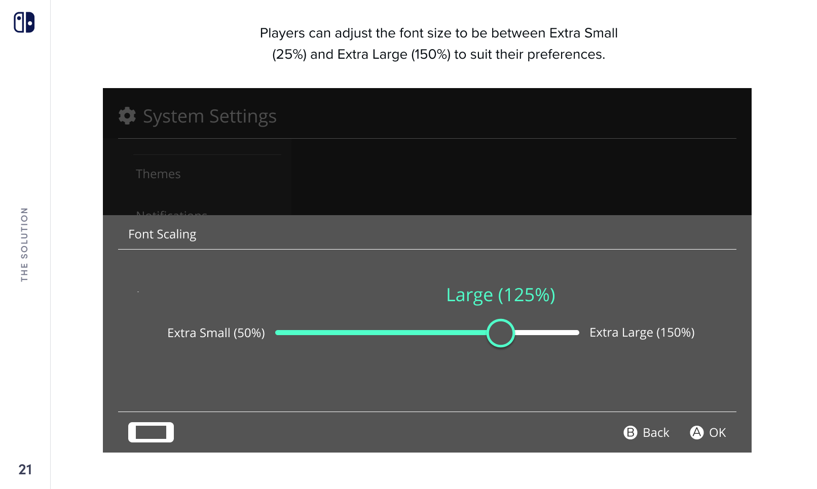
- Font-scaling: slider with sizes represented as percentages, not as fixed units
- Colored buttons: replaceable button-covers, not new controllers
- Screen filters: both pre-set and bespoke settings that can be edited and saved
Finalize
Self-evaluate and summarize completed work
We outlined the barriers, process, and solutions of the project. I ensured that we articulated and acknowledged the shortcomings of our proposed solutions. Some barriers partially remained and some potential ones emerged.
- Font- and UI-scaling: Fonts and UIs would only be re-sized in system menus
- Colored buttons: Not all users could access or afford button-covers
- Screen filters: Not all users would benefit in local, shared-screen multiplayer modes
- Software features: Font-scaling and display palettes are immediate yet intermediate solutions
Deliverables
- Watch the presentation slideshow (YouTube, 13 min)
- Download the Nintendo Switch design report (DOCX, 24 MB)
- View the Nintendo Switch design report (PDF, 20 MB)
- (I edited the report and wrote sections 8 and 9)
Takeaways
People within minority groups are still individuals
The visually-impaired gamers with whom we communicated had a diverse range of needs. Some of their respective needs were opposites to each other. So, a solution to one barrier might ignore, or even worsen, another barrier.
The Power of One is real
Communicating with one expert or one user can have a profound effect on a project’s direction. This effect amplifies if this person’s experience is especially unique.
Inclusive design involves interrogating yourself
Barriers often arise from lack of consideration. Proposed solutions to one barrier might lead, directly or indirectly, to another barrier.
Acknowledgements
- Dr Sambhavi (Sam) Chandrashekar
- Laura K
- Swakirti S
- Tammy T
- Siqing Z


