Amazon Prime Video availability info
Context
I’ve written about Netflix not highlighting content that’s leaving their service. These days, Netflix and their competitors make that information prominent. It often appears on the home/index screen of the service and on the title/info screen of the movie or show. I like to think that designers have read that post and practice my suggestion.
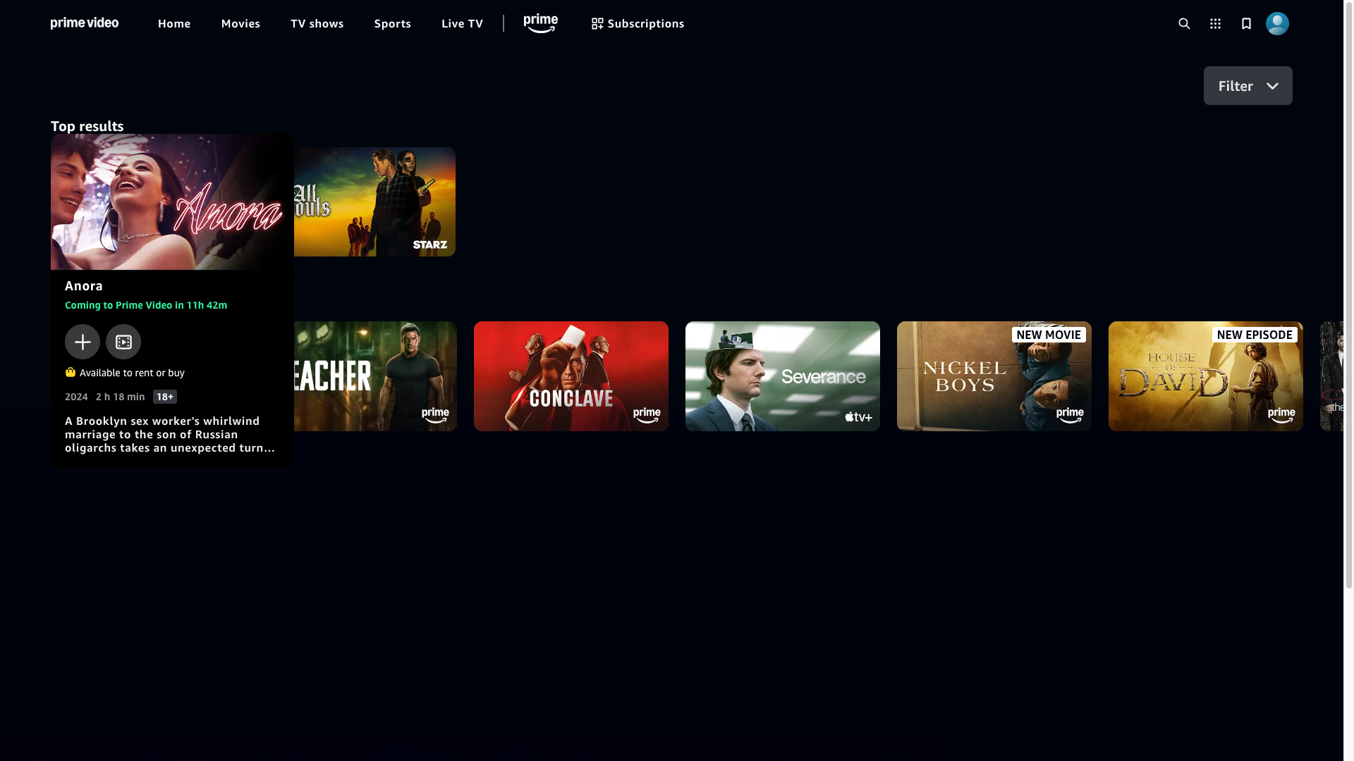
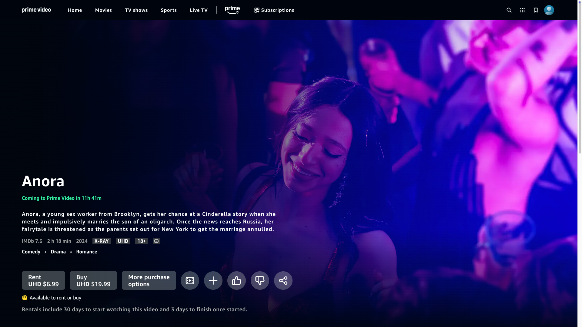
A month ago, I visited Amazon Prime intending to rent Anora. The title screen noted that it would soon be available on for free. I appreciated that information. Amazon, in effect, lost a small bit of revenue by dissuading me from paying for a rental. They enhanced my perception of their service, though. It made their (soon-to-be) free library seem more appealing.
I can’t remember whether it’s common for video-streaming services to promote incoming content. They might not have contractual permission, but it would be another useful practice.