Accessibility audit: Cuphead
I did an audit about the accessibility of Cuphead for a course in UX research and design for video games. To be specific, I used the Game Accessibility Guidelines as a basis. The intent was to identify issues that visually-impaired players might face. For each issue, I described its context, impact, and evidence. I gathered evidence from comments on the web, including blogs, forums, and social media. I already had some evidence from an earlier project.
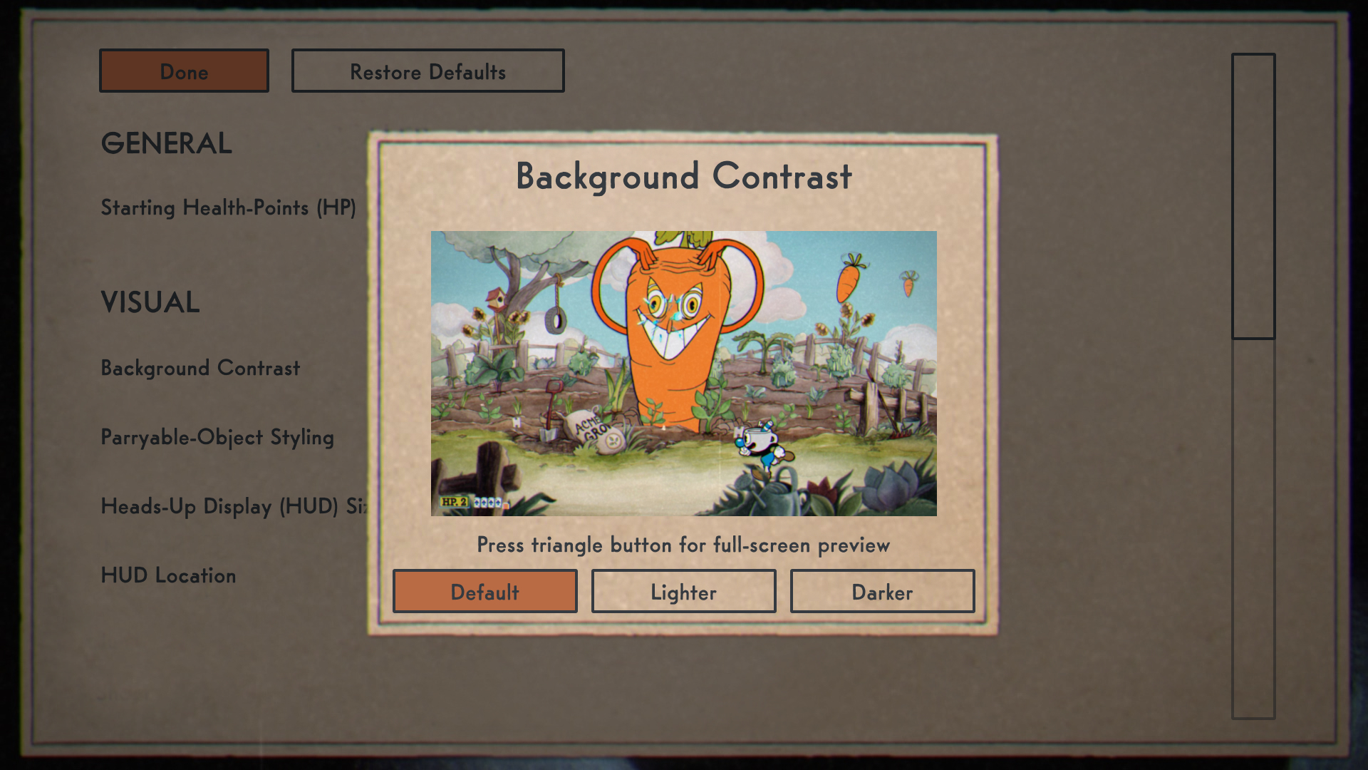
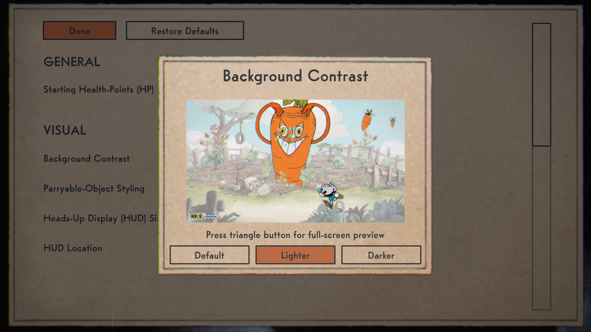
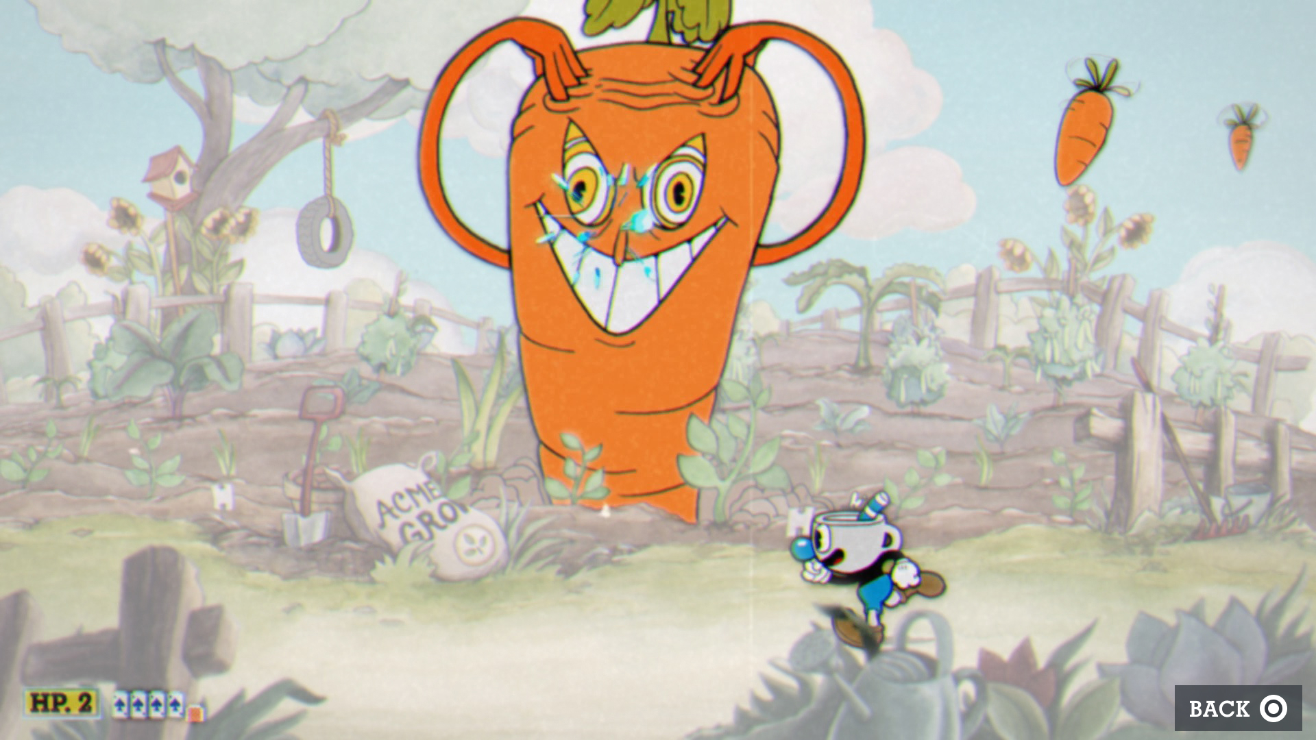
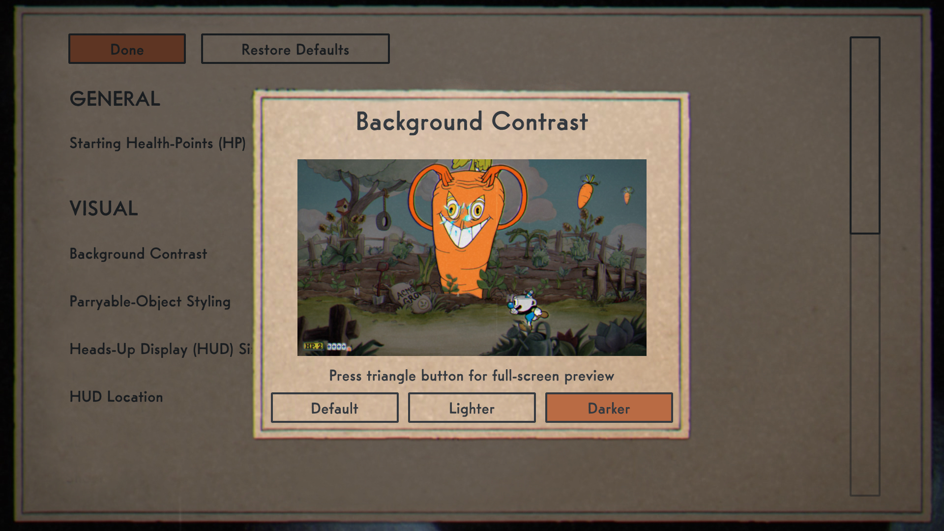
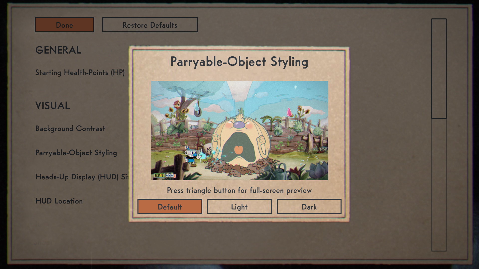
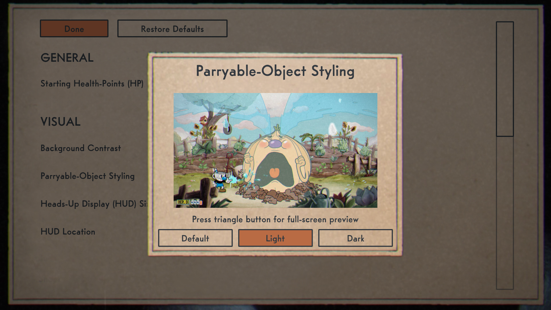
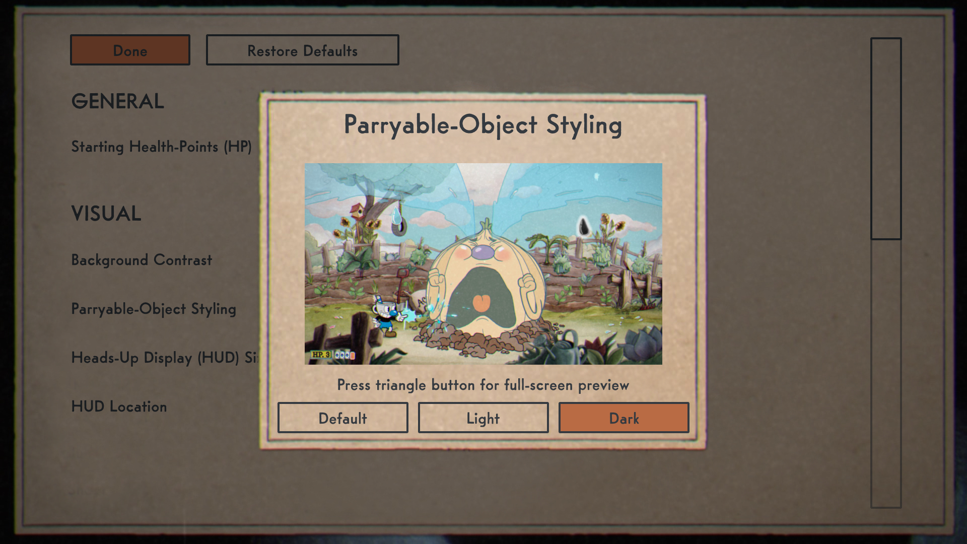
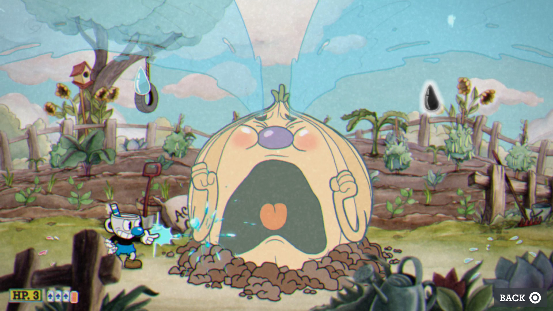
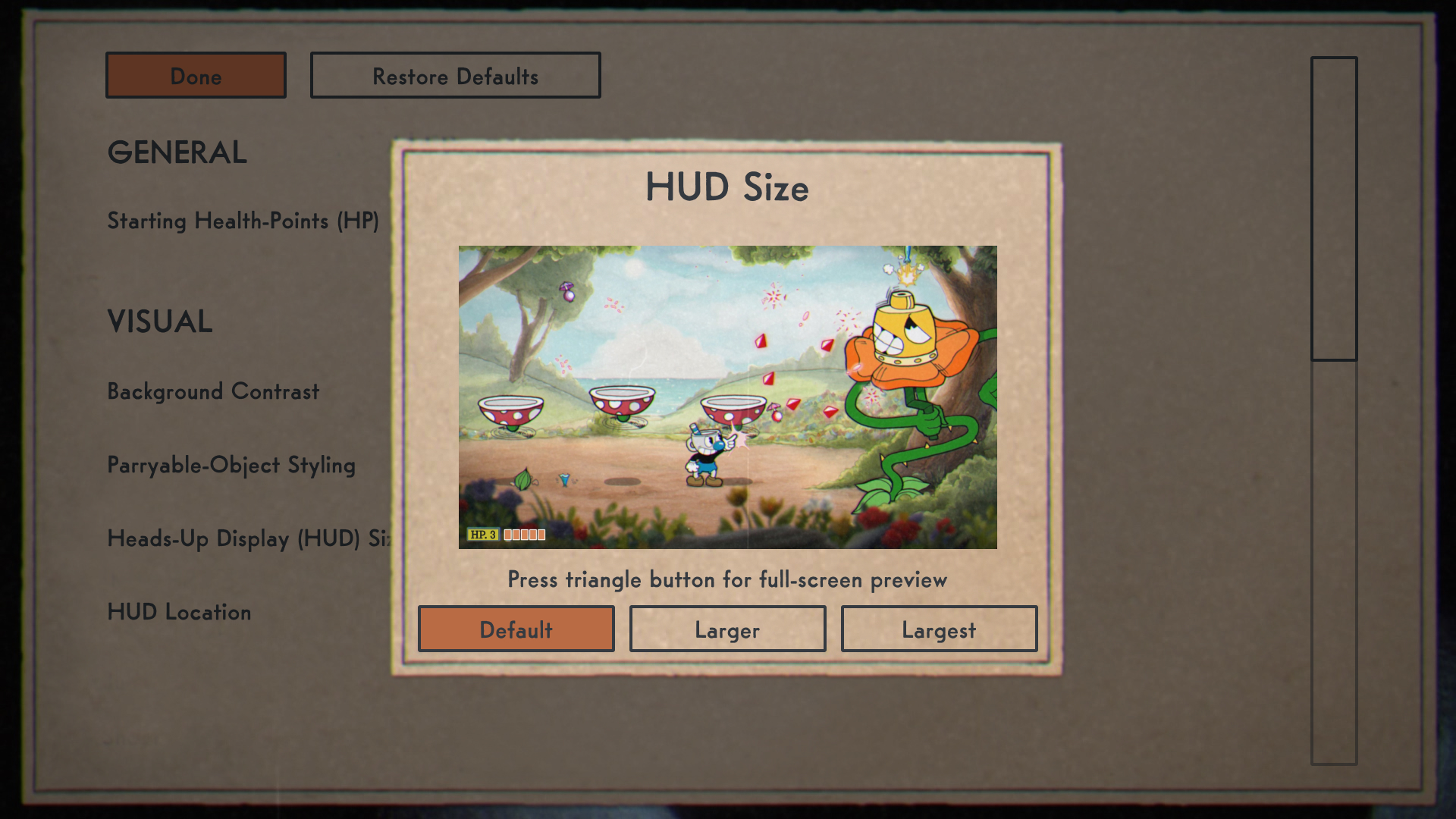
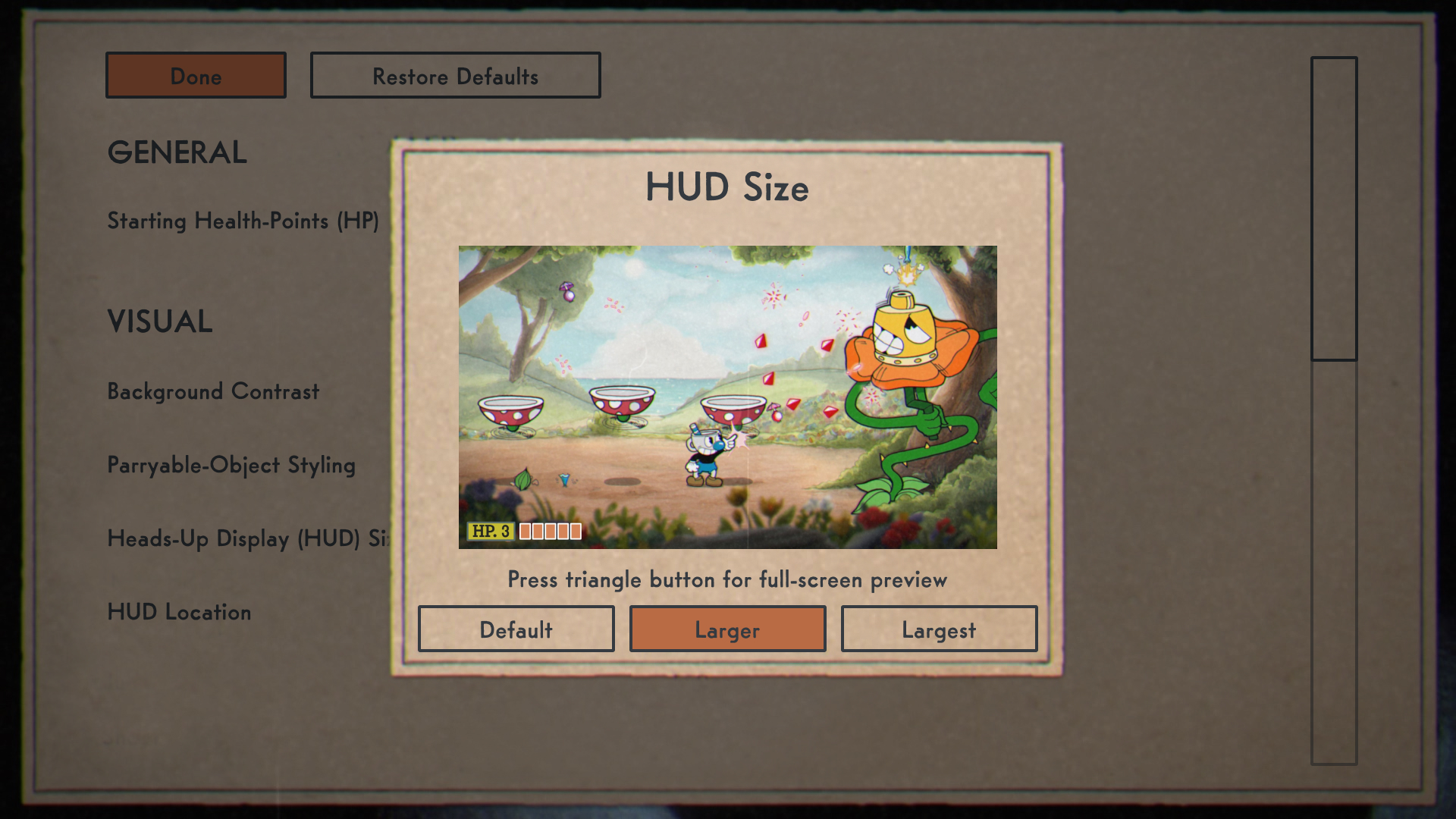
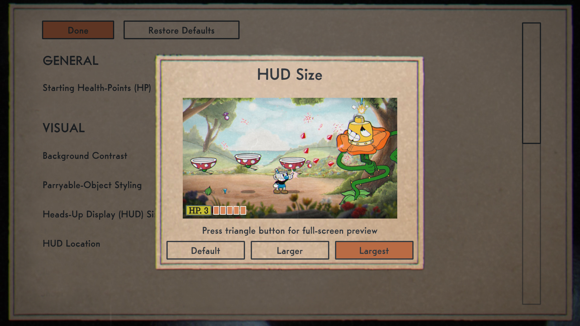
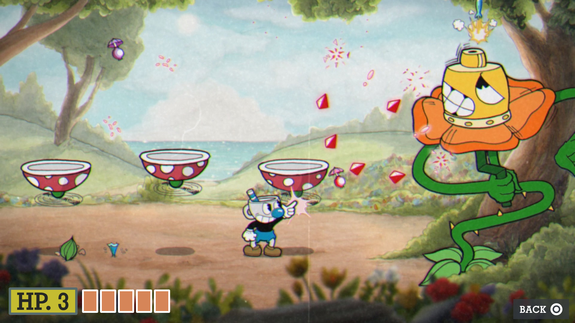
I developed recommendations to mitigate the issues that I identified. I imagined options for subdued backgrounds and colors of parryable objects. I also imagined options for enlarged HUD sizes. Independent volume-control for Super Meter effects and contrast settings are my other recommendations. To realize these ideas, I sketched them by hand. Then I used screenshots, Adobe Photoshop, and Figma to produce mockups.
The mockups showed how these options could be selectable and how they could look in the game. I found the game’s typefaces and used them to make the mockups look more authentic. I posted my work on a message board and got helpful feedback.
Deliverables
- Accessibility audit (PDF, 194 KB)
Artifacts
-
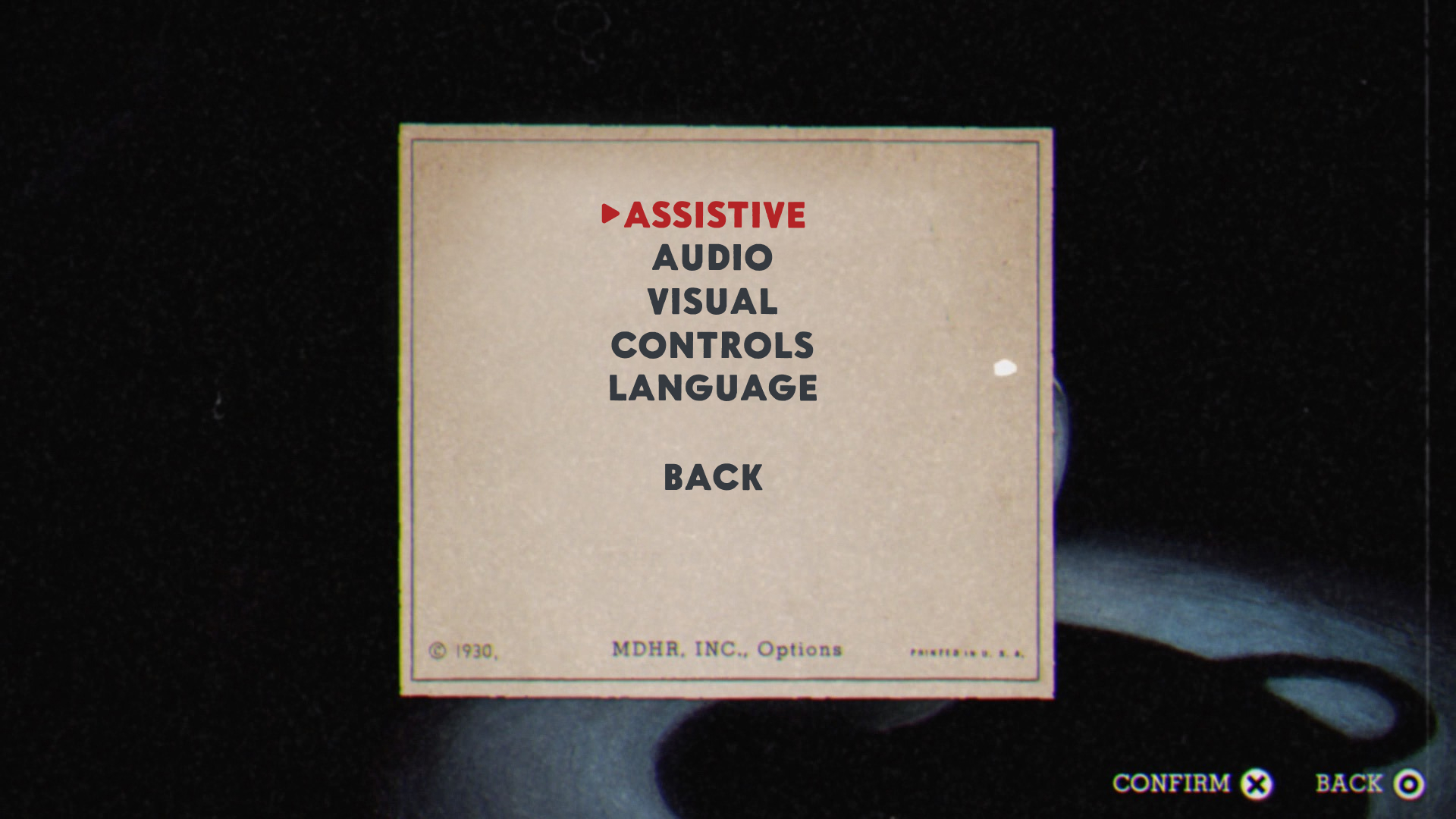
- The Options menu could have a sub-menu called Assistive. The currently selected option can have an arrow-indicator to complement its red text.
-
- The Assistive menu could have the recommended accessibility options. The layout is inspired by the existing Controls menu.
-
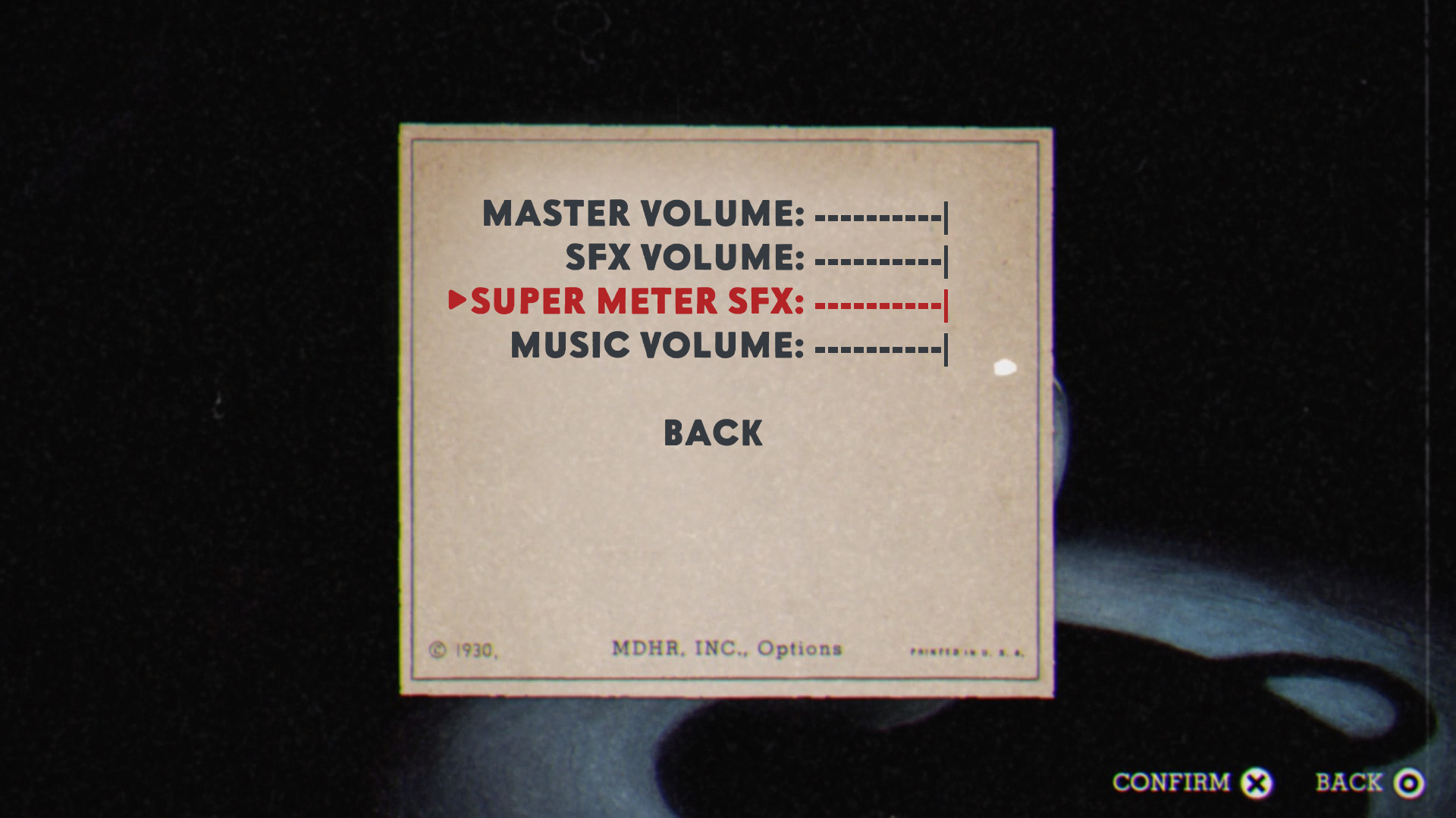
- The Audio menu could have separate volume-settings for sound effects of the Super Meter.
-
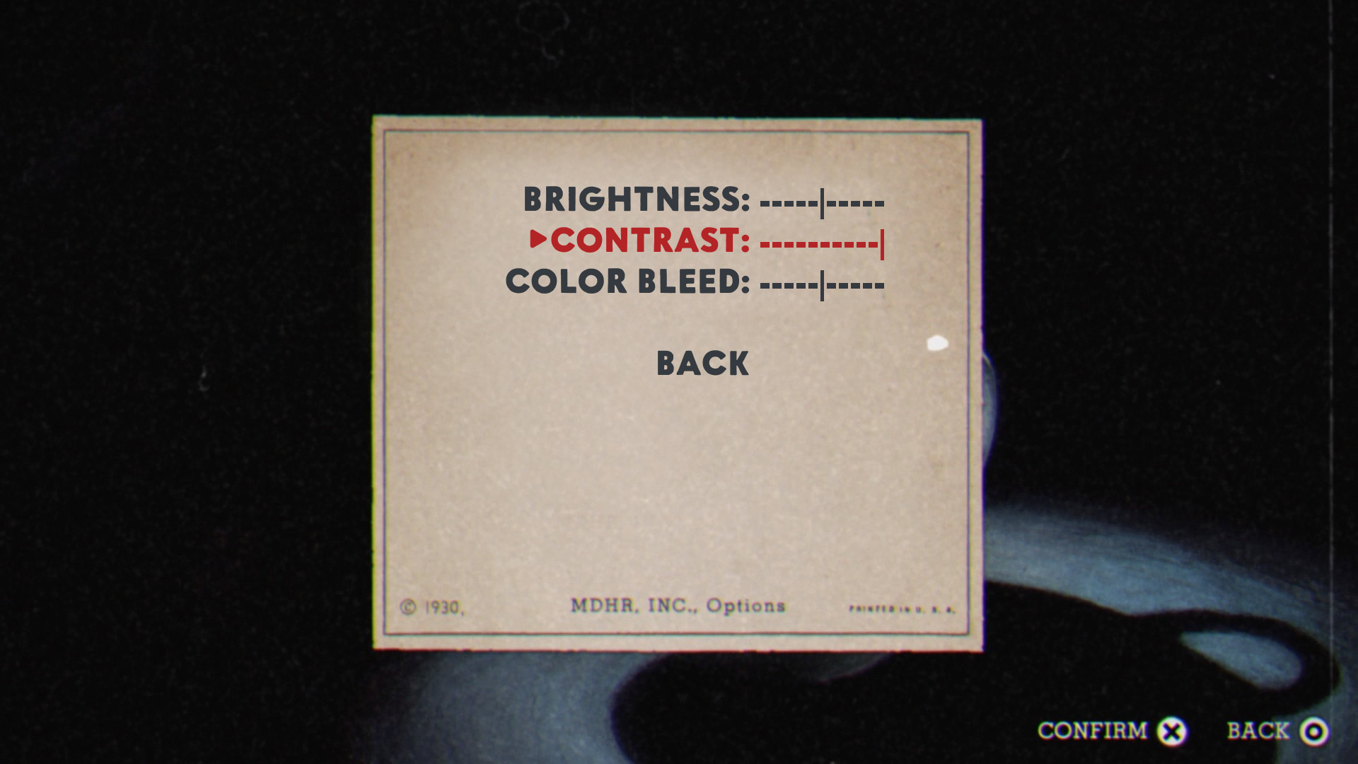
- The Visual menu could have new contrast-settings.
-

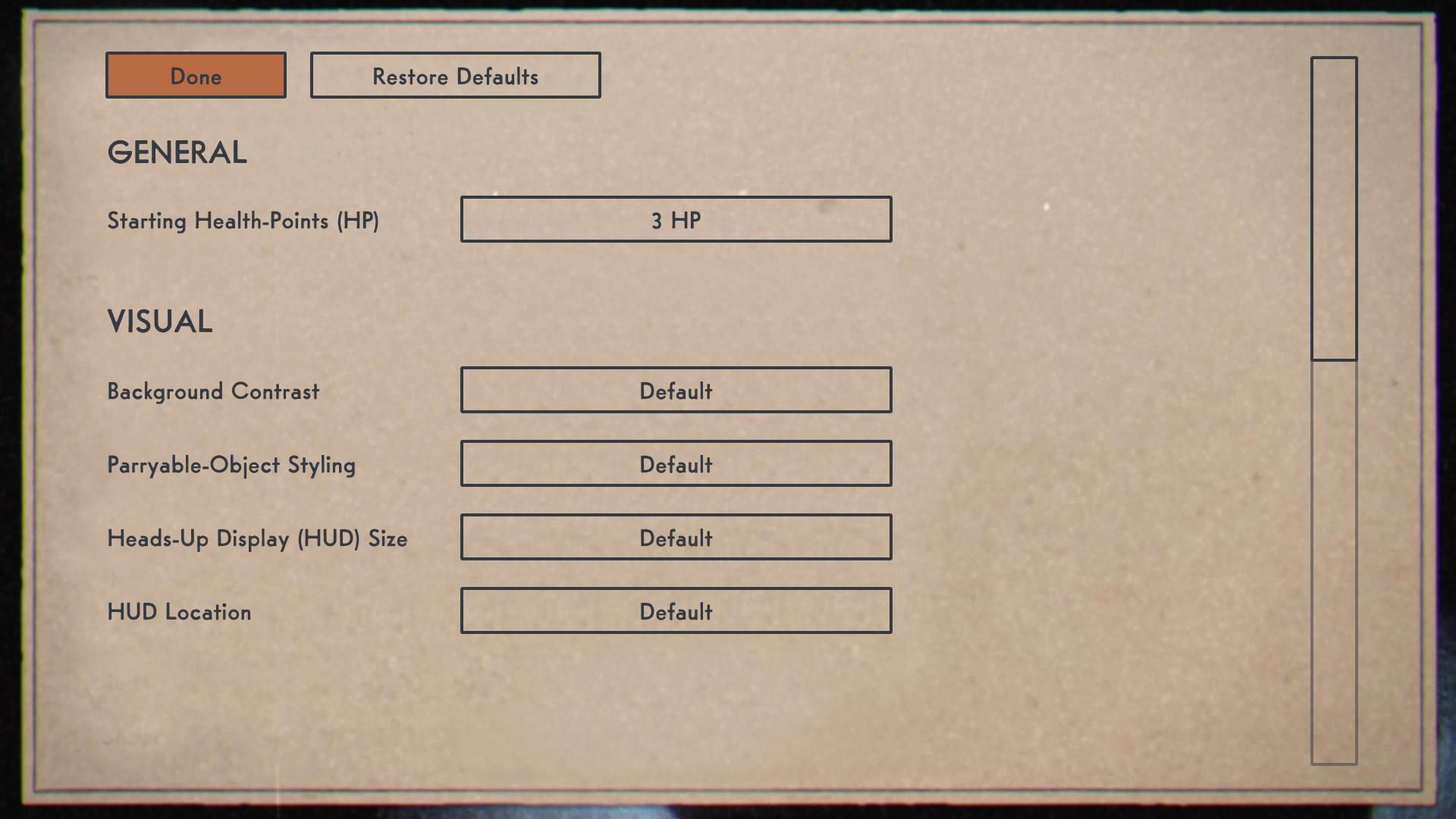
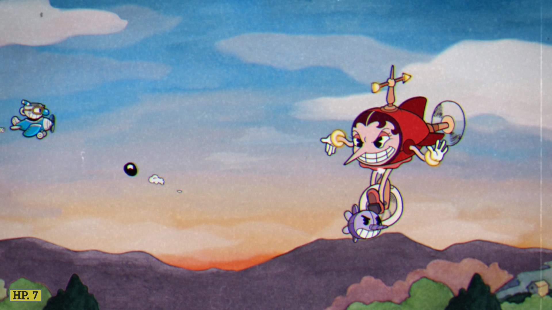
- Players could choose their default number of health-points. The options could 3, 5, and 7 like in Contra III: Alien Wars.
-
- Representing an increased number of HP would simply require showing the number.