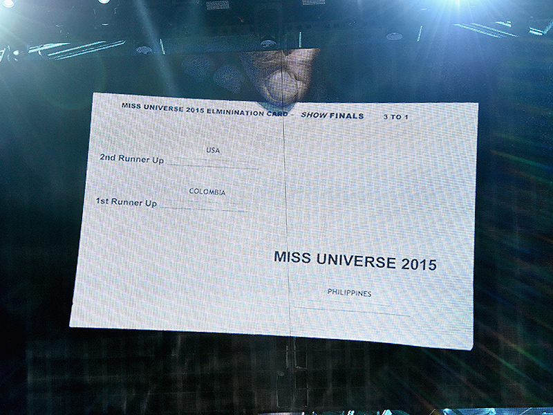
Miss Universe 2015 cue card
- 31 Dec 2015
- Steve Harvey announced the incorrect winner of the Miss Universe 2015 contest. His cue card had an irregular layout, and other design elements, that made it confusing to interpret on live TV.

Context
The Miss Universe 2015 contest was broadcasted live.
- Harvey had a cue card because he and the finalists where standing about 10 feet apart onstage. A teleprompter wasn’t used because the contestants would’ve seen the results before Harvey announced them.
- Harvey announced Miss USA as the second runner-up (third-place contestant) and she was apparently ushered away from the final two contestants.
- Per contest tradition, Harvey was supposed to announce the winner (first-place contestant) and then immediately announce the first runner-up (second-place contestant). Harvey erred when he named Miss Colombia, instead of Miss Philippines, as Miss Universe 2015. Tellingly, he didn’t name the first runner-up.
Flaws

Simply put, the card has three flaws:
- The number-oriented spelling of labels is counter-intuitive in light of the naming convention for runners-up.
- The top-down order of the results doesn’t match the order of the announcements.
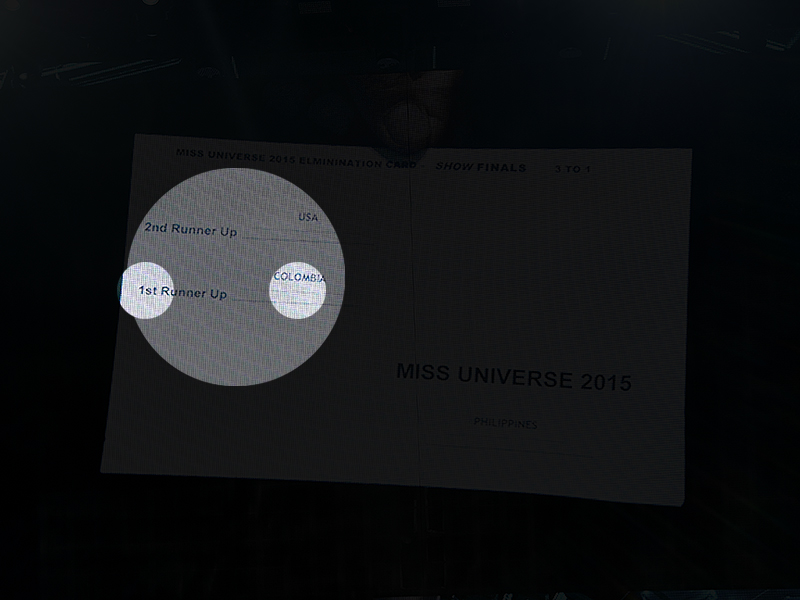
- The most important information is essentially hidden from view.
Selective attention made Harvey fixate on the pair of runners-up written on the card while there was a pair of contestants on the stage. Then, priming made Harvey fixate on the “1st” in “1st Runner Up” when he was going to announce the winner, who was effectively in “1st” place. Because he was under pressure, he only scanned for as long as he believed was necessary.
[Updated 4 Jan] Because of its position in the lower-right corner, “Miss Universe 2015” might’ve been hidden by Harvey’s right hand, which was using to hold the card.
Fixes
Harvey is a seasoned TV host, but he arguably could’ve been better prepared. On the other hand, there is a case of an experienced paratrooper who had knowingly been given a left-handed parachute and then died because he forgot to pull the ripcord: the inherent stress of the free-fall made him revert to his habit of reaching for his right-hand side. The moral of this seemingly apocryphal story is that stress can overwhelm prior and recent learning.
So, rehearsing the announcement wouldn’t have been a fool-proof solution. In place of the card in question, I would’ve designed and written one that,
- Has the same order as the announcement order
- Is numerically listed
- Pairs the winner and the first-runner up
- Is written in prose with rankings spelled as words
- Has typographic styling for points of emphasis and dramatic pauses
Solution
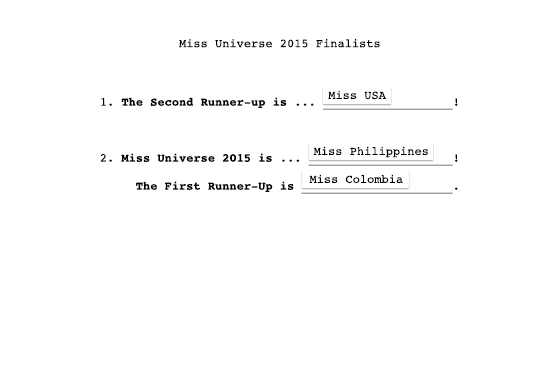
The following text could be used:
1. The Second Runner-Up is … Miss USA!
2. Miss Universe 2015 is … Miss Philippines!
The First Runner-Up is Miss Colombia.
The following design could be used with the text:

Conclusion
Don’t blame Steve Harvey, blame our visual limitations and cognitive tendencies. Being under the proverbial and literal spotlight makes things more difficult as well.