Figma password-creation
- 22 Nov 2021
- To prevent unauthorized sign-in, account passwords need to be long and strong. Figma follows this norm, but it doesn't communicate its rules in the most usable ways.
Context
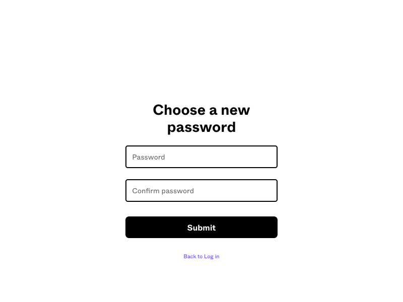
Figma is a popular web-based design application. People need a user-account to design things, which means that they need a password. Like every product that requires signing in, Figma has rules for peoples’ chosen passwords. The process is standard, and the screens for creating/re-setting passwords are simplistic.
Flaws
Password rules are a mystery
Simplicity is a virtue, but the design and copy are too simple in one regard. That is, they don’t list the minimum requirements for passwords.
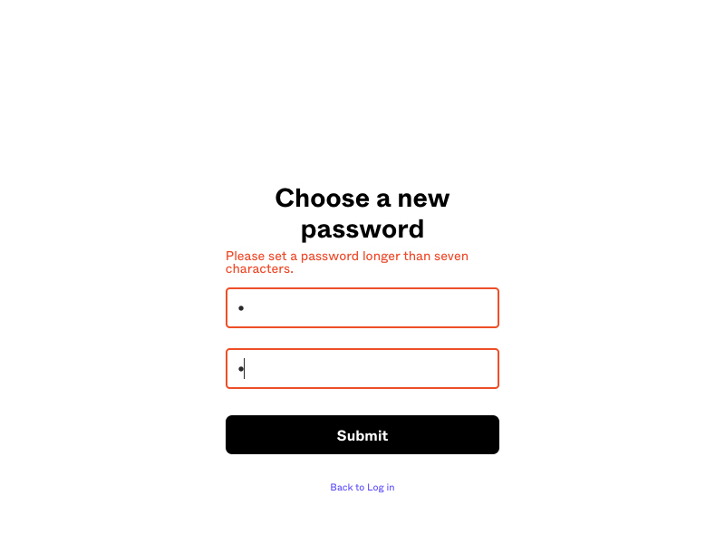
The minimum character-length is implicit
Most people can interpret “longer than seven characters” to mean “at least eight characters.” The former involves a bit more effort to process, though. Somebody who is neurodivergent or who isn’t fluent it English might have some difficulty. I appreciate the error-message being a proper sentence that shows the number as a word. In this context, however, I would argue for representing the number as a digit because it’s easier to process.
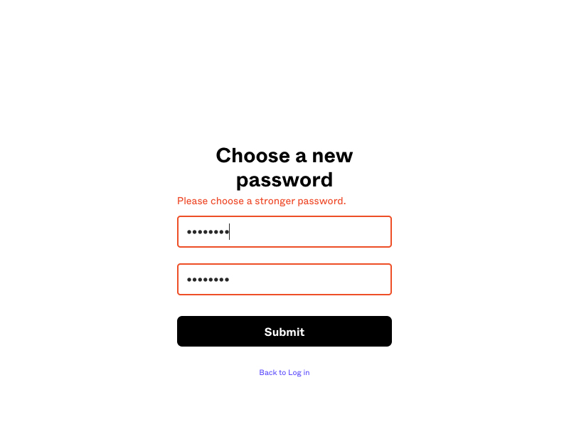
The minimum complexity-level is vague
The site doesn’t specify why some chosen passwords are too weak/simple or how they can meet the strength/complexity requirement. Some sites display a scale for people to gauge their chosen passwords. A few sites offer specific instructions, like avoiding the usage of actual words or even strings that resemble actual words.


