macOS Finder sidebar
- 3 Jan 2016
- The Finder windows of macOS have sidebars that list items in logical sections. These sections can toggle between expanded and collapsed states, but the toggle triggers aren't consistent and persistent.
Context
A couple of weeks ago, I hid the Devices section in the Finder window without realizing it. I assumed that my Mac had stopped recognizing my external hard drive. I later realized that it was working all along. It was only hidden in the Finder sidebar. Ironically, I once worked in a technical support center for Apple, and I solved this same problem for a customer.
Flaws
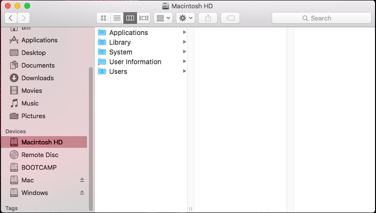
Expanded State
There are no icons or text to suggest that I can collapse the Devices section.

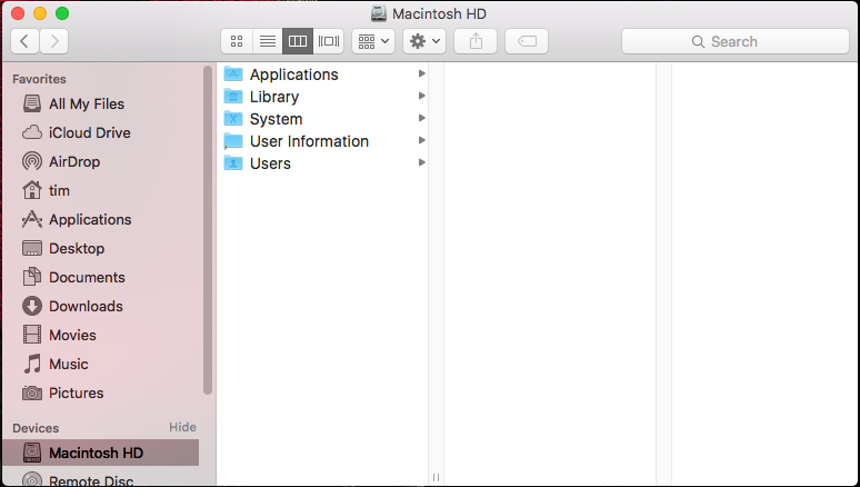
Expanded Toggle
If I put my cursor on the Devices label—or anywhere to the right of it within the sidebar—then, the Hide label appears. To collapse the Devices section, I need to click the Hide label itself.

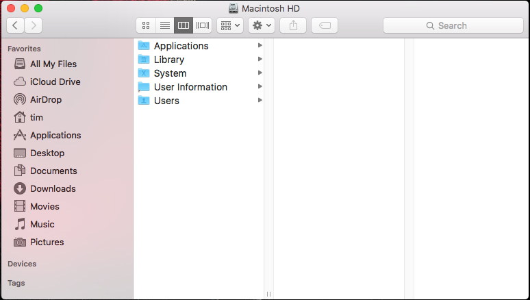
Collapsed State
Apple uses the labels Hide and Show instead of, for example, Collapse and Expand. The Finder sidebar only shows the heading of a collapsed section. The items within that section are completely hidden.

Collapsed Toggle
Like collapsing a section, I have to click a certain spot to expand a section. The clickable spot has an indicator that only appears once my cursor is already on the spot. There are no indicators that lead me to the spot in the first place.

Fixes
Normally, a downward-pointing arrow implies an expanded state, and a rightward-pointing arrow implies a collapsed state. At the very least, the Hide and Show labels should always visible. They might not be close enough to the section headings for max visibility, though.
Conclusion
Toggles should be consistent in their appearance and persistent in their presence.