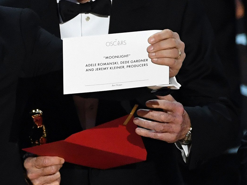
2017 Best Picture card and envelope
- 30 Mar 2017
- Presenters at the Oscars have cards that name the award winners. The 2017 cards have a design that hides the most important information. The envelopes that hold these cards have a similar issue.
Context
Warren Beatty and Faye Dunaway were onstage at the Academy Awards ceremony to announce the Best Picture. Beatty opened the envelope that was in his hand and then he read, to himself, the card that had been inside. Beatty seemed to realize that he might’ve had the wrong envelope and/or the wrong card. He started to announce the winner, but then he encouraged his cohort to make the announcement.
Faye Dunaway next incorrectly announced La La Land as the Best Picture. People who were involved with its production soon gathered onstage, and a few of them gave brief speeches. Then, producer Jordan Horowitz announced that Moonlight was the real winner. PwC, the accounting firm that oversaw the voting and announcements, later took responsibility.
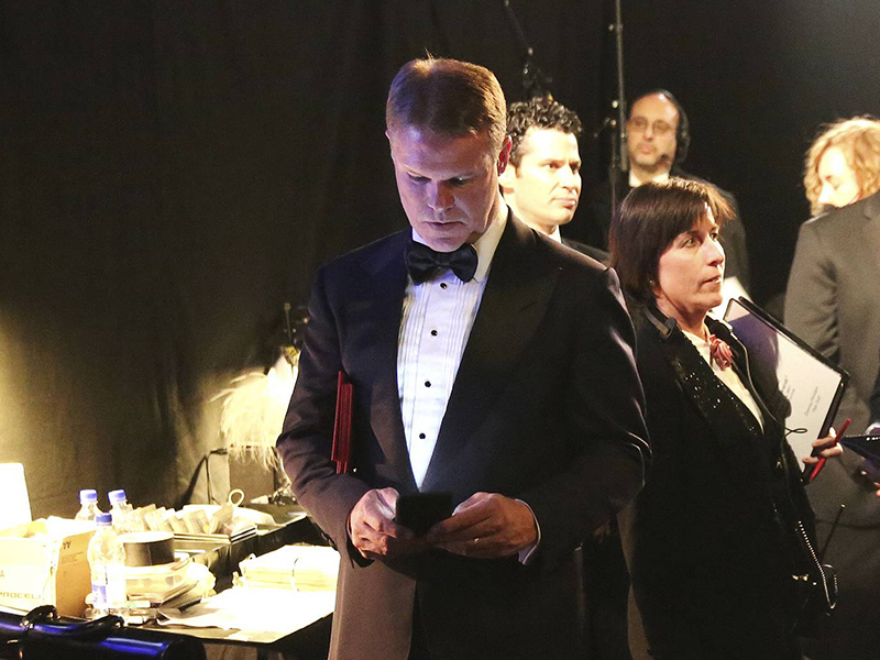
Unlike the Miss Universe pageant, the Oscars have more than one winner. These winners are only known to two PwC accountants who serve as proctors at the ceremony. They each carry and handle one set of envelopes and cards that is identical to the other accountant’s set. They also memorize the winners and notify producers about incorrect announcements.
Flaws
The cards display information in a counterintuitive way. The most important information (the award category) has a a size, a style, and—crucially—a position that make it easy to overlook. Ironically, the most redundant information (the Oscars logo) has the most prominent location.
The envelopes don’t have prominent and readable labels. The front of each envelope lists the award category, but the printing is almost impossible to see. More importantly, the flap on the back of the envelope doesn’t have any label. A label would be useful here because the presenter looks at this area when opening the envelope.
The envelopes and the cards within them are presumably not arranged in the order in which they’re needed. To be fair, I’m making presumptions about the back- and off-stage setup of the ceremony.
Fixes
A more readable card would be useful, but it wouldn’t solve the main problem. The envelope should have obvious labels on both sides. The front-side label will prevent a person from taking a wrong envelope. The flap-side label will prevent a person from opening a wrong envelope. The envelopes of the previous five ceremonies meet this requirement. The only shortcoming of their cards is their lack of the award category. As such, a card could still be put into the wrong envelope.
The envelopes should be on a table and in the order of presentation. The two proctors should each have the support of at least two people. These support people would observe the envelopes as each one is taken. One person should not have sole responsibility because that person will always lose focus.
Lessons
Consider where information needs to be and not just what it needs to be. Information is useless if it’s hiding in plain sight; it needs to be in the exact spot where the user is sure to look. The emotions and attentiveness of the user in the given situation is also important.


